With CSS gradients we can create transitioning color effects when one or more colors fade into each other. In order to create a gradient, we need to use the “background-image” property. CSS gradients come in three forms.
linear gradients
It is created with the linear-gradient() function. We also need to use at least two color stops. These are the colors that transition or flow into each other.
Example:
<div class="gradient"></div>and the css
.gradient {
   background-image: linear-gradient(red, green);
   width: 350px;
   height: 100px;
}
by default the direction of the flow will be from top to bottom. The colors can be in any format e.g. hex, rgba etc.

We can easily change the default direction. To make the gradient to flow to the right, we just need to specify the direction with a keyterm like this: “to right”
background-image: linear-gradient(to right, red, green);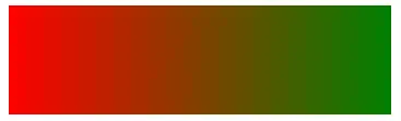
possible keyterms:
- to left
- to bottom
- to top
we can create a diagonal gradient, if we change the direction like this:
background-image: linear-gradient(to bottom left, red, green);
Instead of directions we can use angles by specifying a value of degree.
background-image: linear-gradient(157deg, #0592c8, #f4e722);
We can also use multiple color stops like this:
background-image: linear-gradient(157deg, #0592c8, #f4e722, #e21bc8);
We can also position the color stops by giving each colors a value of percentage or pixel. If we use percentage, 0% is the starting point, 100% the ending point.
background-image: linear-gradient(157deg, #0592c8 30%, #f4e722 60%, #e21bc8 70%);
Radial gradient
Radial gradients radiate out from a central point.
background-image: radial-gradient(#0592c8 30%, #f4e722 50%, #e21bc8 80%);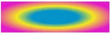
To position the center, we can use the keyterm “at”
background-image: radial-gradient(at 0% 40%, #0592c8 30%, #f4e722 50%, #e21bc8 80%);
The default radial gradient has an elliptical shape, but you can change that by using the “circle” term.
background-image: radial-gradient(circle, #0592c8 30%, #f4e722 50%, #e21bc8 80%);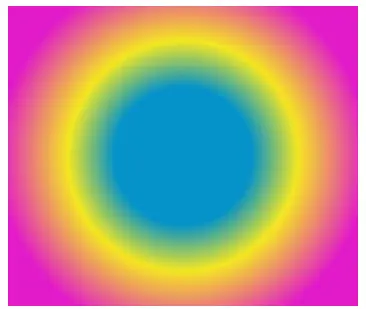
Conic Gradients
Conic Gradients have a color transition that rotates around a center point.
background-image: conic-gradient(#0592c8, #f4e722, #e21bc8);
We can set a degree value to each color
background-image: conic-gradient(#0592c8 40deg, #f4e722 120deg, #e21bc8 180deg);
How to create stripes with css gradient
This is just a quick example:
<div class="gradient"></div>and the css:
body {
   margin: 0;
   padding: 0;
}
.gradient {
   background-image: linear-gradient(to right,
      #0592c8 10%,
      #f4e722 10% 20%,
      #e21bc8 20% 30%,
      #292424 30% 40%,
      #0b9b3b 40% 50%,
      #c70a0a 50% 60%,
      #ce8909 60% 70%,
      #360872 70% 80%,
     #eee2e2 80% 90%,
     red 90% 100%
    );
  width: 100%;
  height: 10px;
}

Browser compatibility
To make sure the gradients look ok in all browsers we have the following vendor prefixes available:
/* Fallback in case of no support */
background-color: blue;

/* Safari 4, Chrome 1-9, iOS 3.2-4.3, Android 2.1-3.0 */
background-image:
-webkit-gradient(linear, left top, right top, from(red), to(#f06d06));

/* Safari 5.1, iOS 5.0-6.1, Chrome 10-25, Android 4.0-4.3 */
background-image:
-webkit-linear-gradient(293deg, #0592c8, #f4e722, #e21bc8);

/* Firefox 3.6 - 15 */
background-image:
-moz-linear-gradient(157deg, #0592c8, #f4e722, #e21bc8);

/* Opera 11.1 - 12 */
background-image:
-o-linear-gradient(293deg, #0592c8, #f4e722, #e21bc8);

/* Opera 15+, Chrome 25+, IE 10+, Firefox 16+, Safari 6.1+, iOS 7+, Android 4.4+ */
background-image:
linear-gradient(157deg, #0592c8, #f4e722, #e21bc8);


Leave a reply
You must be logged in to post a comment.